
.svg)
Wayfinding and Signage Design Ideas for Zollikon Offices
Discover essential Corporate Office Wayfinding and Signage Design Ideas for Companies in Zollikon. Enhance navigation and brand presence today!
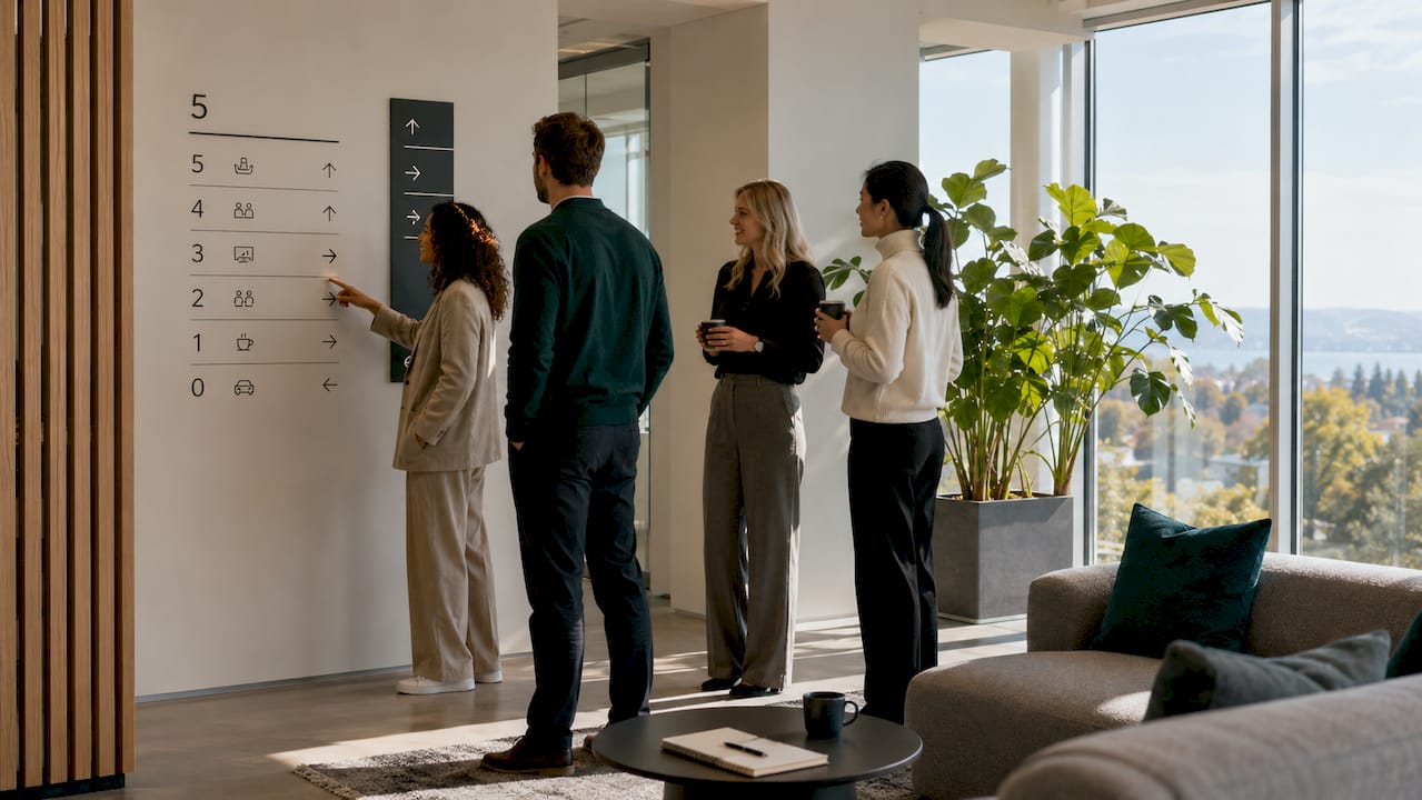
Corporate office wayfinding and signage design is the strategic use of visual systems, materials, and typography to guide people through office spaces while reinforcing brand presence. For companies in Zollikon, this discipline carries added weight. The town’s mix of heritage architecture and modern corporate buildings demands signage that respects existing structures while meeting 2026 accessibility standards. Effective wayfinding solutions for offices do more than point people in the right direction. They communicate who you are as a company the moment a visitor steps through the door. This article covers the core principles, technologies, and design ideas that facility managers and decision-makers in Zollikon need to build signage systems that work.
1. What are the top signage design principles for corporate offices in Zollikon?
Readable, consistent, and accessible signage is the foundation of any effective office navigation system. Without these three qualities, even a well-designed office becomes confusing for visitors and new employees alike.
Readability starts with letter height. The industry standard for readable interior signage is 1 inch of letter height per 10 feet of viewing distance. A sign read from 30 feet away needs at least 3-inch lettering. Multi-floor corporate offices in Zollikon, where corridors can stretch across large floor plates, must apply this rule at every decision point.
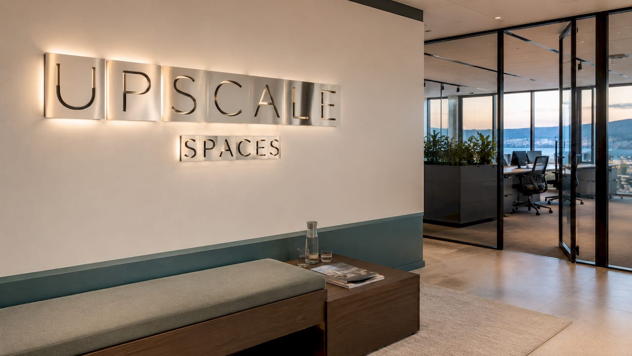
Typography and color choices shape the entire experience. Signage experts recommend earth tones for stability paired with high-contrast typography to communicate brand values instantly. Sans-serif fonts such as Helvetica or Aktiv Grotesk perform best at distance because they avoid the visual noise of decorative letterforms. Stick to one or two typefaces across all signage to maintain a calm, professional atmosphere.
Key design principles to apply across your Zollikon office:
- Consistent mounting heights: Place directional signs at 60–80 inches from the floor across all floors and buildings.
- High-contrast color pairs: Use dark text on light backgrounds, or vice versa, for maximum legibility.
- Tactile and Braille elements: ADA-compliant room signs require Grade 2 Braille and raised characters for accessibility.
- Durable materials: Choose UV-protected acrylics or aluminum composite panels to prevent fading in high-traffic areas.
- Icon consistency: Use the same icon set throughout the building so visitors learn the visual language quickly.
Pro Tip: Create a one-page signage standards sheet before ordering any signs. It should list your approved fonts, colors, mounting heights, and icon library. This single document prevents inconsistency across floors and saves costly reprints.
2. How modular and scalable wayfinding solutions benefit growing corporate campuses in Zollikon
Modular signage systems are the most practical choice for Zollikon’s corporate offices, particularly in buildings that blend historic fabric with modern interiors. A modular approach means individual sign components can be swapped, updated, or relocated without replacing the entire system.
“A ‘kit of parts’ signage approach enables consistent visual identity across multi-building campuses, preventing a disconnected feel and simplifying the scaling of signage systems.”
For heritage buildings in Zollikon, the installation method matters as much as the sign itself. Modular mounting systems using steel pipes integrated into brickwork protect the historical fabric of a building while allowing easy updates when tenants or layouts change. This approach avoids drilling directly into decorative stonework or damaging original plaster.
Here is how a modular system delivers value across a growing corporate campus:
- Phased installation: Roll out signage floor by floor as your office expands, without disrupting the existing system.
- Tenant flexibility: Swap room name plates or directional inserts when departments relocate, without replacing the frame.
- Brand updates: Refresh color panels or logo plates when your brand identity evolves, at a fraction of the cost of full replacement.
- Multi-building consistency: Apply the same kit of parts across separate buildings to create a unified campus feel.
- Reduced long-term cost: Professional-grade UV-protected acrylics and aluminum composite panels prevent fading and warping over 18–24 months, lowering total cost of ownership.
The table above shows that modular systems offer the best balance of flexibility and cost for most Zollikon corporate offices. Digital-only systems suit high-traffic lobbies but rarely justify the cost across an entire building.
3. What innovative technologies enhance wayfinding effectiveness in corporate offices?
Digital and interactive technologies are changing how visitors and employees navigate office spaces. The most effective corporate signage ideas in 2026 combine static and digital elements rather than replacing one with the other.
QR-code-based wayfinding saves 1–2 minutes per visitor by reducing manual directions. In busy Zollikon offices, this translates to more than 200 minutes of receptionist time saved each week. Visitors scan a code at the entrance and receive a map directly on their phone, with turn-by-turn directions to their meeting room.
Technologies worth integrating into your office navigation signage:
- Dynamic digital directories: Touchscreen panels in lobbies display real-time room bookings, visitor schedules, and floor maps. They update automatically when meetings change.
- QR-code wayfinding stations: Printed or etched QR codes at key decision points give visitors instant mobile navigation without requiring an app download.
- Mobile-integrated room booking: Platforms that connect signage displays to your calendar system show live room availability outside each meeting room door.
- Hybrid work indicators: Digital panels outside meeting rooms show whether a space is occupied, booked, or available, which is critical for hybrid teams sharing desks and rooms.
- Wayfinding integration with commercial fit-out planning: Working with fit-out specialists who incorporate wayfinding in commercial projects from the start avoids costly retrofits later.
Pro Tip: Do not replace all static signs with digital screens. Static signs never go dark during a power outage or software update. A hybrid approach, using digital directories in lobbies and static signs in corridors, gives you the best of both systems.
4. What are standout corporate signage design ideas for Zollikon companies?
The most memorable office signage combines functional navigation with visual identity. These ideas work across Zollikon’s range of corporate environments, from lakeside financial offices to converted heritage buildings.
Your office as your brand starts at the entrance. Dimensional letters with LED backlighting in reception areas create a strong first impression without requiring large wall space. The depth of the letters catches light differently throughout the day, adding visual interest that flat printed signs cannot achieve.
Standout design ideas to consider for your Zollikon office:
- Branded color integration: Carry your brand’s primary and secondary colors through directional signs, room identification plates, and floor graphics. Visitors unconsciously associate the color system with your company.
- Environmental graphics and value walls: Large-format graphics featuring your company’s mission, values, or history turn blank corridors into engaging brand statements. These work especially well in waiting areas and near boardrooms.
- Textured signage panels: The global market for personalized and customized products is projected to reach $201 billion in 2026, reflecting a clear shift toward tactile, human-centric design. Textured panels in wood grain, brushed metal, or stone-effect laminates add warmth and reinforce premium positioning.
- ADA-compliant room signs with design intent: Compliance does not mean plain. Combine required Braille and raised characters with your brand colors and materials for signs that are both accessible and visually appealing.
- Floor graphics and zone markers: Color-coded floor zones help visitors orient themselves on large floor plates without looking up at wall signs. This is particularly effective in open-plan offices.
Office design trends in 2026 show a clear move toward signage that feels integrated into the interior rather than applied on top of it. The goal is a space where the signs feel like they belong.
5. How to maintain and update wayfinding signage for long-term efficiency
A signage system is only as good as its maintenance plan. Without regular upkeep, even the best-designed signs fade, warp, or become outdated, undermining both navigation clarity and brand perception.
Pro Tip: Schedule a signage audit every six months. Walk every floor with a checklist that covers legibility, mounting integrity, Braille condition, and brand color accuracy. Catching small issues early prevents expensive full replacements.
A practical maintenance framework covers these areas:
- Master signage standards guide: Document every approved font, color code, material specification, and mounting height in a single reference document. A phased signage standards plan supports brand consistency and makes updates faster and cheaper.
- Material selection for longevity: UV-protected acrylics and powder-coated aluminum resist fading in high-traffic and exterior locations. Facility managers who choose lower-cost materials often face premature replacement within 18 months.
- Planned update cycles: Align signage updates with lease renewals, office reconfigurations, or brand refreshes. Phased updates cost less than emergency replacements.
- Feedback loops: Collect input from facility managers and frequent visitors about confusing decision points or missing signs. Real-world navigation problems are the most reliable signal that your system needs adjustment.
- Exterior sign inspection: Zollikon’s lakeside climate includes humidity and UV exposure. Inspect exterior signs quarterly for delamination, fading, or mounting corrosion.
Simplicity in signage design avoids competing visual elements and enhances clear orientation. The same principle applies to maintenance: a simple, well-documented system is far easier to keep consistent over time than a complex one with no standards guide.
Key takeaways
Effective corporate wayfinding in Zollikon requires a modular, brand-aligned signage system built on clear readability standards, durable materials, and a maintained standards guide.
Why signage deserves the same attention as furniture
Most facility managers I work with treat signage as a final-stage checkbox. The furniture is selected, the layout is finalized, and then someone asks, “What are we doing about signs?” That sequencing is the single biggest mistake in corporate office design.
Signage is not decoration. It is the first system a visitor interacts with, and it shapes their perception of your organization before they shake a single hand. In Zollikon, where many corporate offices occupy buildings with genuine architectural character, poorly chosen signage reads as an afterthought. It cheapens spaces that deserve better.
The most effective approach I have seen treats signage as a cohesive system from day one, integrated with the broader office design rather than bolted on at the end. That means choosing materials that complement the interior palette, mounting systems that respect the building structure, and a standards guide that keeps everything consistent as the office evolves.
The technology piece is genuinely exciting right now. QR-code wayfinding and dynamic directories are mature enough to deploy reliably, and they solve real problems in hybrid work environments. But the companies that get the most value from them are the ones that also invest in quality static signage. The two systems reinforce each other.
My honest advice: allocate signage budget early, document your standards before you order a single sign, and treat every sign as a brand touchpoint. The offices in Zollikon that do this consistently are the ones that feel considered, professional, and worth visiting again.
Upscalespaces can help you design signage that works
Zollikon companies that want signage to function as a genuine brand asset need more than a sign supplier. They need a design partner who understands how wayfinding integrates with architecture, interior design, and corporate identity.
Upscalespaces specializes in corporate office design across Switzerland, including full wayfinding and signage integration. The firm’s six-step process covers everything from initial consultation and design conceptualization through to material selection, logistics, and project completion. Whether your Zollikon office is a heritage building requiring modular mounting solutions or a modern floor plate ready for digital directories, Upscalespaces brings the expertise to make it work. Reach out to start a consultation and see how a well-designed signage system can change how your office feels from the first step inside.
FAQ
What is the standard letter height for office signage?
The industry standard is 1 inch of letter height per 10 feet of viewing distance. A sign read from 30 feet requires at least 3-inch lettering to remain legible.
How does QR-code wayfinding reduce staff workload?
QR-code-based wayfinding saves 1–2 minutes per visitor by eliminating manual directions. In busy offices, this saves more than 200 minutes of receptionist time each week.
What makes modular signage better for Zollikon heritage buildings?
Modular mounting systems using steel pipes integrated into brickwork protect historical building fabric while allowing easy sign updates when layouts or tenants change.
How often should corporate signage be inspected?
A signage audit every six months covers legibility, mounting integrity, Braille condition, and color accuracy. Exterior signs in Zollikon’s lakeside climate warrant quarterly checks.
What materials last longest for corporate office signs?
UV-protected acrylics and aluminum composite panels resist fading and warping over 18–24 months, making them the most cost-effective choice for high-traffic corporate environments.
Recommended
- 7 Reasons why
- Project Syz Private Bank | Upscale Spaces
- Compact office space solutions for Swiss corporate teams


