

Swiss Office Colour Concepts: 5 Steps From Evidence to Real Rooms
Plan a Swiss office colour concept with evidence based palettes, practical zoning and five clear steps to test choices under real workplace lighting.

A balanced, zoned colour concept supports focus, creativity and wellbeing, provided it follows the 60/30/10 rule and is tested under your real lighting. This is supported by a peer-reviewed study on accent colours and the Swiss workplace lighting guidance. Practical palettes and a stepwise method follow below.
TL;DR:
- Use the 60/30/10 rule: let the dominant color cover about 60%, the secondary 30%, and accents the remaining 10%, reserving bold hues for small, replaceable details.
- Test large paint samples under actual lighting for several days, because color effects vary by person, task, exposure, materials, and time of day.
- For visual tasks, Swiss guidance recommends lighting at 5300–6500 K and a high color rendering index; saturated paints may also make rooms appear dimmer.
- Keep brand colors in secondary finishes or movable accents, use calm tones in focus areas, and ask staff before choosing culturally loaded shades.
Upscale Spaces
upscalespaces.com
Bring Your Office Colour Concept to Life
Upscale Spaces creates tailored office interiors, coordinating design, furniture and logistics to shape functional, employee-focused work environments.
What a colour concept is and why it matters for the workplace
A colour concept is a coordinated plan for walls, finishes, furniture and accents that supports your brand, the work done in each area and the wellbeing of the people using it. It is not decoration added at the end. We treat it as part of the same plan as lighting, acoustics and materials, because each one changes how the others look and feel.
That coordination matters because people react differently. Research on office interiors finds that the effect of colour on performance is highly individual, and that stated preferences often do not predict measured results. So a concept should never rest on one person's taste. Ask staff what they need from each zone, test your options in the room, and then decide.
Swiss workplace rules also set practical limits. SECO states recommended illuminance for office tasks and links daylight and proper lighting to worker wellbeing. A palette that ignores these limits can look good in a sample photo and still work badly at a desk.
How colours influence mood, focus and creativity
A systematic review of colour in work environments concluded that colour affects mood, wellbeing and work-related outcomes. Blue and green are frequently preferred and tend to be linked with calm and positive affect. Colourful environments can also support performance better than strictly achromatic ones, which explains why an all-white office often feels flat.
The results are more nuanced for warm tones. Red and similar colours can stimulate in one setting and distract in another, depending on the task and how long people are exposed. Cool tones are often described as calming, yet some studies suggest they can dampen creativity while others suggest the opposite. The honest reading is that no single hue wins everywhere.
Coloured accent light raised creative performance: a peer-reviewed study by Jan Dul and Canan Ceylan found that blue and red accent lighting increased approach motivation and, through that route, improved creative performance compared with white accent lighting in work and learning areas.
Longer exposure and personal sensitivity also change the picture. A study of office colour and environmental sensitivity found that laboratory results differ from real-world outcomes and that visual complexity matters. The practical lesson is to zone colour and dose it carefully: stronger colour where people stay briefly or work creatively, calmer tones where they concentrate for hours.
Practical palettes and zoning: dominant, secondary and accent
The 60/30/10 rule gives you a simple structure. Around 60 per cent of the visual field carries the dominant colour, usually walls and large built-in surfaces. About 30 per cent carries the secondary colour, such as furniture, partitions or a feature wall. The final 10 per cent is the accent, kept for cushions, artwork, task chairs and small joinery details.
These starting palettes can work in many offices:
- Focus-led neutral: warm light grey dominant, muted blue secondary, small blue accents on chairs and screens.
- Warm collaborative: soft sand dominant, muted clay or dusty green secondary, brass or timber accents.
- Creative studio: pale neutral dominant, one confident secondary, saturated accents on movable pieces.
Zoning then decides where each one goes; for guidance on maximising efficiency in confined spaces, see this article on small office suites layout features that save space. Focus desks suit calm, low-saturation tones. Meeting rooms can take a warmer secondary colour to encourage conversation. Breakout areas can carry the strongest accents, and circulation routes work best with light, neutral surfaces that keep sightlines open.
On large flat surfaces, stay muted, because saturated colour changes how bright a whole room feels. Keep your boldest choices for small, replaceable accents.
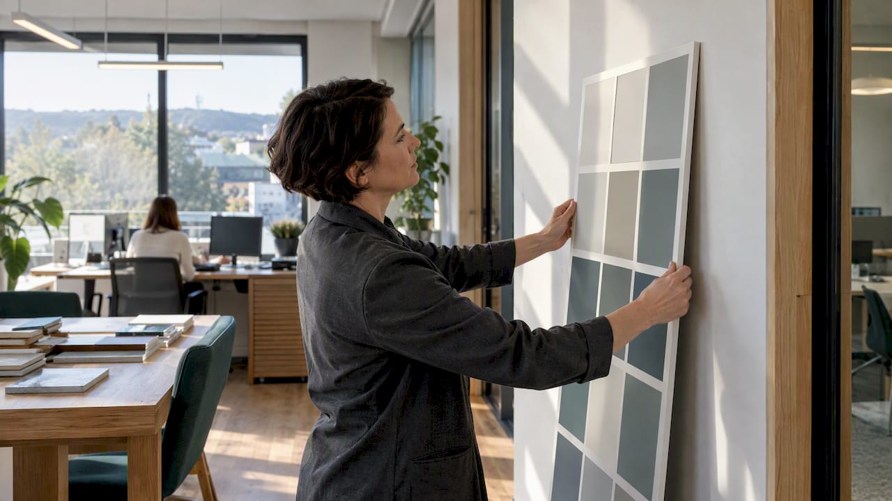
Pro Tip: Paint a large sample board and move it around the room at different times of day before committing to a dominant colour.
Lighting, materials and ergonomics: how they change what you see
Colour never exists apart from light. Swiss guidance recommends daylight-like artificial lighting with colour temperatures between 5300 and 6500 K and stresses sufficient illuminance and a high colour rendering index for visual tasks. SECO also lists recommended illuminance for office work.
These points shape any palette:
- Saturated paints reduce perceived brightness, so a deep colour may need stronger or better-placed light.
- Matt paint, glossy joinery and textured textiles reflect light differently, so the same colour looks different on each.
- Safety markings must stay recognisable, and strong decorative colours must never hide them.
- Screen work needs higher light levels and good glare control, as SUVA's lighting checklist notes.
- Always test samples in the actual lighting and record the light level and the appearance of the colour.
Step-by-step: create and test a colour concept for your office
A decision-maker can follow this process alone or hand it to a consultant. Allow time for planning and involve facilities, HR and a small pilot group of staff.
- Define goals per zone. List the primary tasks in each area and gather constraints such as budget, existing finishes and lighting.
- Audit light and materials. Photograph rooms at different times of day and, if possible, measure lux and colour temperature.
- Choose zoning and draft palettes. Apply the 60/30/10 rule to each zone, keeping a shared thread between zones.
- Mock up and test. Paint small areas and test them under real lighting for at least a few days, then gather feedback from the pilot group.
- Finalise specifications. Fix paint, finishes and procurement details, and include acceptance criteria for contractors.
Pro Tip: Photograph every mock-up beside a neutral grey card, so you can compare colours later without relying on memory.
Quick palettes and examples for common office types
These palettes are starting points you can copy and adjust to your light:
- Open-plan focus: light neutral dominant, muted blue secondary, teal accent. Choose matt finishes and check that the lighting does not turn the blue grey.
- Meeting and counselling rooms: warm neutral dominant, soft green secondary, subtle cream accent. Reduce glare and add soft textiles to calm the acoustics.
- Creative studio: light grey dominant, warm yellow secondary, saturated coral accent. Limit how much coral sits in the field of view and use it on movable items.
Before you commit, apply sample panels to the walls, hold furniture swatches next to them, and view everything under the lighting you will actually use. A palette that works across these checks is less likely to cause problems later.
Considerations for brand identity integration in office colour concepts
Your brand colours belong in the concept, but rarely as the dominant tone. A strongly saturated corporate colour on every wall can tire people and change how bright a room appears. We usually treat brand colours as the secondary or accent layer, and let a calm neutral carry the large surfaces.
Start by translating the brand palette into usable tints. A deep brand blue, for example, can become a pale blue-grey on walls, a mid-tone on upholstery and the full colour on a reception feature. This keeps the identity recognisable without making the whole floor feel like a logo.
Research is a useful reminder here: preferences often do not predict measured performance, so a concept should combine brand elements with zoned design for different tasks. A reception can be brand-heavy, while focus areas stay quieter.
Consistency matters more than volume. Repeat brand-derived tones across signage, joinery and textiles, and use the same finishes throughout. Visitors will read the brand through repetition, and staff will experience it as a pleasant rhythm rather than a constant shout.
Impact of cultural differences on colour perception in European offices
Colour meanings are not universal, and European offices often bring together staff from several backgrounds. The systematic review of colour in work environments notes that although blue and green are frequently preferred, preferences vary by culture, age and task. A palette that feels calm to one team can feel cold or dull to another.
In practice, this argues for restraint on symbolic colours. Red can signal energy in one context and warning or loss in another. White can suggest cleanliness or sterility. Rather than guessing, ask your staff directly, especially in international teams, and treat the answers as a design input.
It also helps to rely on tones that are broadly well received: soft blues, muted greens, warm neutrals and natural timber. Use stronger, more culturally loaded colours only as small accents that are easy to change. If a colour proves unpopular, replacing a few cushions or artworks is far cheaper than repainting.
Age and sensitivity also play a part. The ZHAW's inclusive workplace design guidance recommends low-stimulus zones with neutral colours and dimmable lighting for neurodiverse and sensitive staff, which suits mixed teams well.
Trends in sustainable and eco-friendly office colour schemes
Sustainable palettes lean on earthy, natural tones: muted greens, clay, sand, soft terracotta and warm greys. These work well with the green and blue shades that research links to calm, and they sit comfortably beside timber, cork, wool and other natural materials.
Sustainability also affects what you do, not only what colour you choose. Keeping a good existing finish and refreshing it with a few accents avoids waste. Choosing durable, repairable furniture in timeless colours means you will not replace it when trends shift. Low-emission paints and finishes support better indoor air, which sits alongside lighting in SECO's guidance on lighting, climate and indoor air quality.
A practical approach is to keep the permanent layer calm and natural, and place trend-driven colour on the layer you can swap. Wall paint stays neutral, while textiles, planters and artwork carry this season's accent. That way, your scheme can age gracefully without a full redecoration, and your fit-out stays in use for longer.
How to coordinate colour concepts with ergonomic furniture design
Ergonomic furniture is usually chosen for adjustability and support first, so colour has to adapt to it. Task chairs, sit-stand desks and monitor arms often come in limited finishes, which makes them a fixed part of the palette. Plan around them early, rather than hoping a paint colour will match later.
Neutral desks and frames in light timber, white or grey keep the visual field calm and let you vary the accent through chair upholstery. Guidance on seated and standing work emphasises movement and correct posture, so furniture that encourages changing position deserves priority over a perfect colour match.
Glare is the other link. Glossy desk surfaces and very light work surfaces can reflect lamps into the eyes, which the SUVA lighting checklist treats as a point for careful control. Choose matt finishes where screens are used.
Finally, check how screens look against the walls behind them. A very saturated wall behind a monitor can tire the eyes, while a calm mid-tone backdrop reduces contrast.
Case study examples showcasing before-and-after office colour transformations
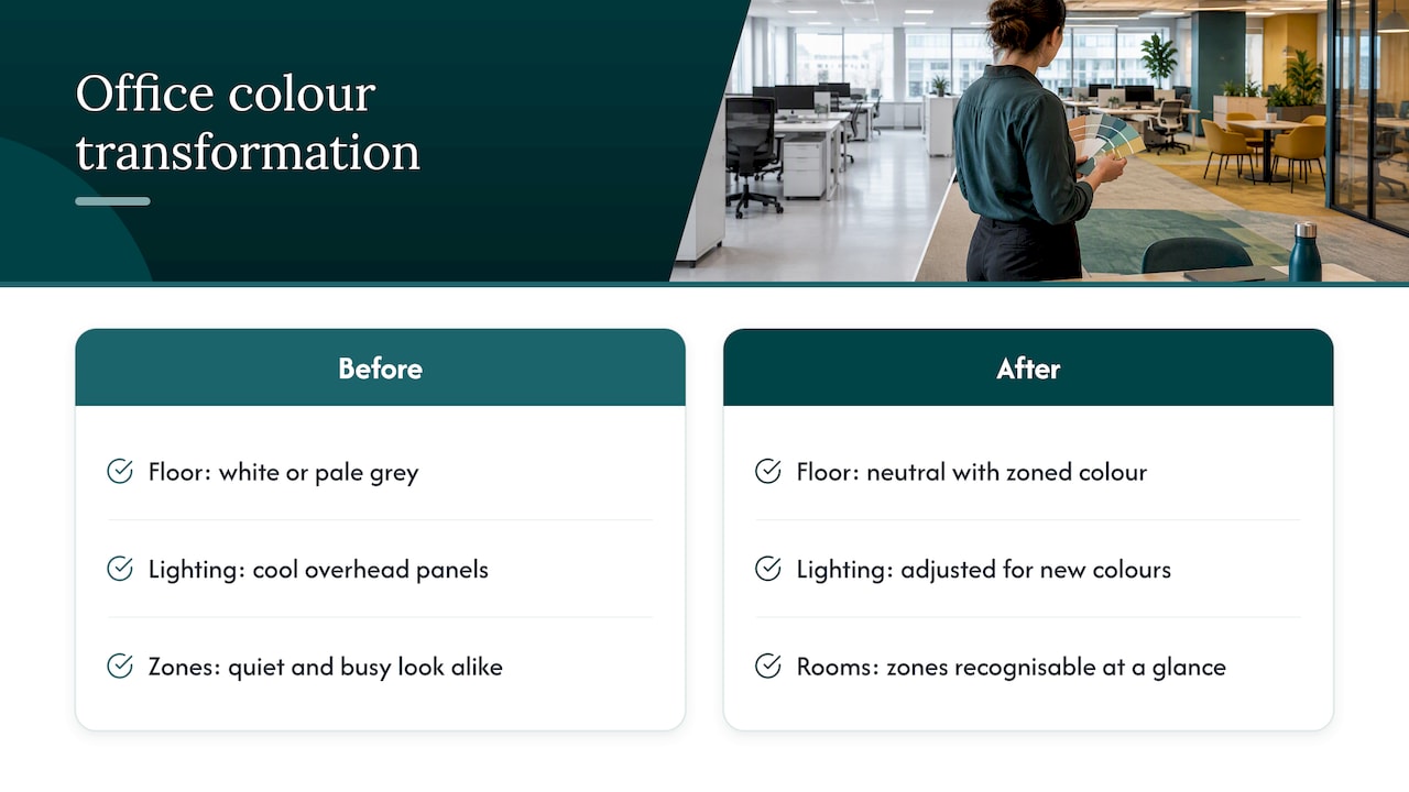
A typical before-and-after story starts with a floor that is uniformly white or pale grey, lit by cool overhead panels. People describe it as clinical, and the quiet and busy areas look identical. Our approach in such a project is to add structure rather than simply more colour.
In a common scenario, we keep a light neutral as the dominant tone, introduce a muted blue-green on focus walls and partitions, and warm up the meeting rooms with a soft clay or sand secondary. Accents appear in chairs, rugs and artwork. The result is a floor where each zone is recognisable at a glance, while the whole still reads as one calm space.
What changes is less the paint than the way people use the rooms. Breakout areas become real destinations, meeting rooms feel more welcoming, and desks sit against calmer backdrops. Lighting is adjusted alongside the paint, so the new colours are seen as intended rather than distorted by the old fittings.
The lesson from these projects is consistent: test small areas first, keep accents swappable, and judge the outcome by how the spaces are used, not only by how they photograph.
Design perspective: why we start with light, not paint swatches
Most colour mistakes we see begin with picking a colour from a card. We work the other way round: our six-step process runs from consultation and custom offer through design concept, furniture selection and logistics to completion, and colour concepting is part of the design stage, tied to lighting and furniture from the start. Organisations usually want brand, productivity and wellbeing at once, and the trade-offs are resolved by zoning rather than by compromise. A calm neutral base with confident accents can help balance identity and visual comfort. Colour is a tool for guiding behaviour, and it works best when it is deliberate.
— Valerie Vecerova
How we can help you deliver your Farbkonzept
We offer end-to-end office interior design, including the colour concept, lighting coordination, mock-ups and furniture procurement. The usual next step is a consultation, followed by a pilot mock-up that tests your palette under real conditions before anything is painted at scale. Request a consultation and we will walk you through the process.
FAQ
What colour options work well for an office?
Soft blues and greens are often preferred and linked with calm, as a systematic review of colour at work concluded. Warm neutrals suit meeting rooms, and saturated accents suit creative areas. Preferences vary, so test options with your own team.
What is the 60/30/10 rule?
It splits a room into a dominant colour, a secondary colour and an accent. The dominant tone covers about 60 per cent, usually walls, the secondary about 30 per cent, such as furniture, and the accent about 10 per cent in small details. It keeps a scheme balanced and easy to adjust.
How do I create a colour concept for my office?
Define goals for each zone, audit your light and materials, and draft a palette per zone. Then test small mock-ups under real lighting for several days, gather feedback and finalise the specifications. Colour effects on performance are highly individual, so testing with staff is essential.
Does lighting change how office colours look?
Yes, colour temperature and light levels alter how paint and finishes appear. Swiss guidance recommends colour temperatures between 5300 and 6500 K and a high colour rendering index for visual tasks. Always view samples under your actual lighting.
Sources
- Tandfonline
- Onlinelibrary
- The Effects of Colour in Work Environment: A systematic review
- Wegleitung zu den Verordnungen 3 und 4 zum Arbeitsgesetz


